

This post may contain a few affiliate links, meaning if you make a purchase through them I may earn a small commission at no extra cost to you! As an Amazon Associate I earn from qualifying purchases.
All photos and artwork, as well as written articles on this site, were made by a human being. And always will be :) No ai will ever be used here.
So you have a photo that you really like and would like to try doing a painting of it. Where do you start? How do you start? I’ve broken down the steps here that I take on how to make an easy watercolor landscape painting manageable for beginners!
Need supplies? I put together a list of the essentials that you’ll need for this tutorial.
Choosing a Photo
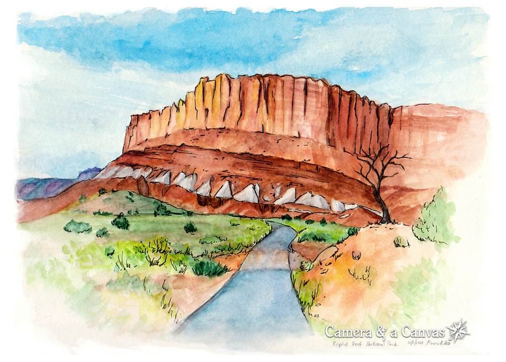
I take hundreds, sometimes even thousands, photos when I travel to different places. So I generally have quite a big handful to choose from. For this piece I wanted a shot of the road, along with a part of the neat rock formations found in Capitol Reef National Park.

I liked the way the road pointed straight at the formation in this picture, and the orangey colors along with the darkening sky stood out nicely. But…as you can see the right side of the photo is pretty blurry and uninteresting.
Good thing we’re artists though!
You don’t have to use the entire photo as is. You can choose to paint just a part of it, or even take out, add, or rearrange elements in it if it doesn’t matter if it’s painted exactly as is. In this case, I decided to just crop off that side to make for a better composition.

Things to ask yourself when choosing a photo for a painting:
- What’s the subject of the photo I’m aiming for, or what parts of the photo are important?
- Is there something in the photo that’s distracting from the main subject, that I should leave out for the painting?
- Do I want to use the whole photo as is, or is it just being used as inspiration-meaning I can move the different elements around more artistically?
- Should I crop it? Think about composition–would it look better to have something dead center, or off center?
Rough Sketch
Ok, you’ve got your photo chosen and an overall idea of how you want to make this painting. So let’s start…with a rough sketch!
It’s called Rough Sketch for a reason, do not start with any detail! Just use big basic shapes to get the overall proportions and structure lined up right.
Have you ever started a drawing, and it’s looking good so far, you keep going along…then all of a sudden you realize you won’t be able to fit the whole picture on the page because you didn’t pay attention to getting the proportions right?

Start with basic, simple shapes. I can’t emphasize this enough(it’s bolded and italicized!). Simple shapes are easy to draw, anyone can do it, and you won’t cry that you have to erase half of your beautiful drawing because the rest won’t fit.
Detailing the Drawing
Ok, now you can start detailing a bit more! How much you detail is really up to you, but I like to get a solid sketch of this quality-basically all the important lines that I really want to be there.

Do not feel like you have to detail everything! In fact, leaving out some details can make the final painting more interesting, and easier on the eyes believe it or not. When everything is too bland, it’s uninteresting. The same is true for when everything is too detailed. Our eyes and minds need variety.
So detail the important parts of the painting. What you want people to focus on. What really needs to be there. You can leave the rest loose, and up to how the paint falls- which can be neat and what gives watercolor painting its charm!
Starting the Painting
In most cases when using watercolors, you’ll want to start painting from Light to Dark. You’ll also want to start painting in broad backgrounds of color, that other, darker, colors will sit on top of.
For this particular painting I used a starter set of Daniel Smith watercolors. The Extra Fine Essentials Set to be exact. They come in a set of 6 and have a nice carrying container too. Only 6 colors?! Yup…you can mix just about any color with a basic set of colors. I got these because I wanted to try professional quality paints, to see what all the fuss was about. They are definitely nice! More expensive, yes, but I know I’ll have them for a long time as a little bit goes a long way.
If any spots in your painting need to be white, you need to be mindful of them and try your best to paint around it so the paper will show through. The paper will be your white color. Gouache or other opaque paints should only be used in small locations if necessary. They never will give the same white glow that the paper itself will.
*Don’t forget you can always use a paper towel to soak up water and paint if it goes into a spot you don’t want. You can also try cleaning your brush off, and just dipping it in water, then rubbing it slightly on the spot you want paint removed. If you rub too much the paper will start to chip apart.

First, I started with painting the sky. Starting with the lighter blues, then adding darker ones in large areas with an oval wash brush. I used my finer tip round brush to go around the edges of the rocky cliff.
Just as we did in the rough sketch, this step is really about blocking in all the basic colors. We’re not focusing on details here. Just about getting the colors right

Second, I decided to paint the orange cliffs, because they were the second biggest shape that I could put the “same” color on. I say same loosely because, as I mix colors myself, inevitably each brush stroke that picks up more paint in the palette will have a slightly different color to it. I don’t mix a lot, and I may need to remix if I need more paint.

For the next step I loosely color in almost all the rest of the parts of the painting. Mixing different greens for the grass and bushes, the slightly different shades of gray for the road, and I start the tree too, putting in a dark brown for the trunk.
I more carefully colored in the light gray rocks on the red cliff face, because they’re smaller and what I think is an important unique detail. I try as best as I can to stay in the lines with them, but since they’re lighter colored than the red behind I can just paint more red over them in places I may have gone too far.
Adding Depth with Shadows & Details
So far the painting has been quite loose and very mono tone. We need to introduce some darker colors for the shadowy parts to make it pop a little. There’s not a great deal of contrast in the original photo, but I try to give it a little more anyway, and make the one side of the cliff darker.

I also darkened in the long, vertical cracks along the top part for detail, and gave it some of the horizontal striations found there as well. It doesn’t look perfect, but that’s ok. It’s just a suggestion and inspiration of what’s there!

For the final painting step, I try deepening the shadowy areas even more by going over them again with more paint. I also go over parts of the rock face with more reds to get the colors more saturated, along with the greens in the mid to foreground, and also the sky. I wanted them to pop out a bit more.
For the foreground I chose to leave it washed out. It’s not very interesting, so I wanted to leave it more artistic and painterly. Remember-not everything has to be fully detailed or even painted. Sometimes what you leave out can be just as important to the piece as a whole!
Finishing Touches
I thought my painting was finished at this step. I got done with it one night, and was pretty happy with it. The next day I looked over it and felt something was missing. After I scanned it into the computer I really felt something was missing-it seriously did look better in real life!
I thought about adding some lines on top of it, although I was afraid it might ruin the painting. I took the chance anyway however…and I was definitely happy I did!
The black fine tipped pen lines added the structure the piece needed to hold it together and really make it stand out and say, “it’s complete”. As you can see I didn’t draw lines over everything, just the important parts and places I felt needed it. You don’t have to draw every rock, every leave, every branch and blade of grass, etc… Just draw enough to be a suggestion of what’s there and what’s important.
All of these steps can take some time and experimentation to get right. I did a lot of watercolor paintings before this that I wasn’t too happy with, and I hope to keep improving even more in the future. So don’t get discouraged, keep trying and working at it: practice, practice, practice! No one gets good over night.
If you do any watercolor work with these steps, I’d love to see what you come up with! Use the tag #TravelArtExplorers on Instagram and other social media!
Save this tutorial on Pinterest!
